
Ever wondered how the title type for a series gets designed? I’ll show you my inspirations for the title type of the Toffle Towers series. I’ll also show you how I designed the series’ quirky shuttle bus vehicle.
My new book Toffle Towers book 3 is out now! It’s written by Tim Harris and illustrated by me. You can grab a copy at the links at the bottom of this blog post.
To celebrate the release of third book in the series, I’ve prepped a bunch of behind-the-scenes blog posts. I’ll show you how I designed the characters; how I designed the cover for book 1; how I designed the hotel’s exterior; and how I designed the hotel’s interior. But today, I’m showing you how I designed a couple of other things – the hotel’s unique shuttle bus, and the title typography.
Title typography
I’ve always loved typography; in fact I’ve designed the title type for a bunch of my books (see The Last Viking and my S.Tinker Inc graphic novel series). So I mocked something up for the Toffle Towers series too. I looked at old-fashioned shop and hotel signage for inspiration. Here are some reference pics I collected.  Then I started mocking something up. I wanted it to be old-fashioned but quirky and fun. This is what came out.
  Luckily, the publishers liked it. It was a rare case of the first idea being good enough!
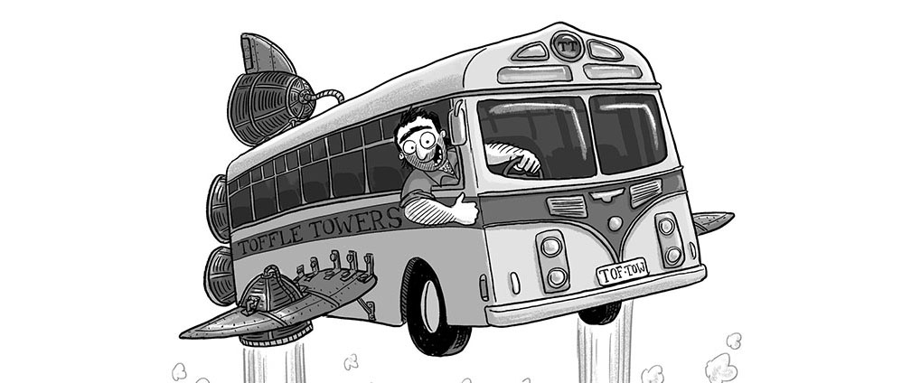
The ‘Shuttle’ Bus
Tim described it as an old bus with wings and 6 rocket engines bolted on. I wanted it to be an old chrome bus, so that it would look retro and space-age. I found what I was looking for on a google image search.
 I also had to figure out in my head how it would be able to take off and land in small spaces without destroying anything. I settled on VTOL (vertical take off and landing) engines like you find on Harrier jump jets. There would be a rocket in each of the shuttle bus wings, and these would be able to rotate to provide both downward and forward thrust. I needed to figure out if the whole wings would rotate, or just the engines, so I tried it a bunch of ways.
  Once the design was finalised, I could draw the bus in action. Here’s a rough of one of the internals from book 1:
 … and here’s the final.
  And here’s the bus as it appears on the cover of book 1.
  You can check out more behind-the-scenes blog posts for Toffle Towers here.
Toffle Towers 3: Order in the Court
 Buy online:
– Booktopia (Australia/NZ only)
– Dymocks
– QBD (Australia only)
– Readings
– Angus & Robertson (Australia only)
– Book Depository
Toffle Towers 2: The Great River Race
 Buy online
– Booktopia (Australia/NZ only)
– Dymocks
– QBD (Australia only)
– Readings
– Angus & Robertson (Australia only)
Toffle Towers 1: Fully Booked
 Buy online
– Booktopia (Australia/NZ only)
– Kinokuniya (Australia only)
– Dymocks
– QBD (Australia only)
– Readings
– Angus & Robertson (Australia only)
