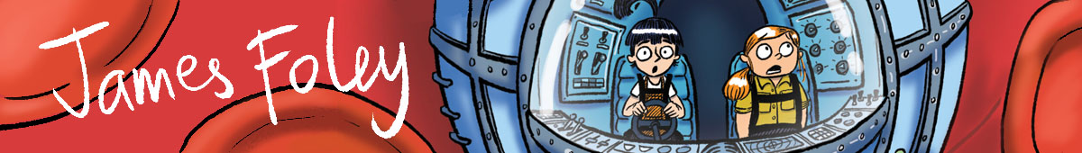
Hi everyone,
I’m going to run you through the process we took to design the cover. I’ll split it into three parts- initial design; refining the design with Cate; and final colour.
So- initial design… Norm and I started by looking at the posters for epic adventure movies- things like Lord of The Rings, Star Wars, Indiana Jones – and of course, Viking films. Adventure films all have a similar ‘design dialogue’- features that set them apart from other movie posters, and make us think adventure without realising it. There are often many characters shown on the poster- the heroes, the villains- and maybe an important scene from the film, or a creature, or a vehicle of some sort. Characters are all sorts of different sizes, with the main characters towards the front and secondary characters smaller and more faded towards the back. Often you will just have a character’s head shown. They will often brandish their weapons. There is dramatic lighting. Etc. Posters for comedies don’t look like this. Posters for horror films don’t look like this. Posters for thrillers or ‘chick flicks’ or romantic comedies don’t look like this- they’re all features found on adventure films. And it doesn’t whether the film is set in Middle Earth or Norway or Nazi Germany or A Galaxy Far, Far Away- if it’s an adventure film, that’s how the poster seems to look.
Seeing as this picture book is a bit of an epic saga, Norm and I thought it would be good to follow the design dialogue of the adventure movie posters for our cover. Here’s the first thumbnails sketches I drew- they were very small, each only 3 or 4 cm across.
 Cate liked the look of these and asked me to draw up a larger rough. Here’s what I came up with- this was my first sketch for the front cover:

and back cover (with the bullies):

Then I edited these in photoshop, cleaned them up and bit, and added in some borders and background that I had already used on internal pages of the book.

Here’s just the front cover, blown up a bit.
 A lot of the features of adventure film posters are here- the characters are all different sizes, arranged circularly around the title; there is an important vehicle from the story (the Viking Ship), and (in my head) I can see some dramatic lighting taking place.
I showed this to Cate, and she sent back an edited version with some suggestions for changes. I’ll show you Cate’s version next week.

One thought on “Creating the Cover, Part 1- initial designs”