Still under the influence

Last week I spoke about some of the other illustrators who influenced my approach to The Last Viking. I forgot a couple of important ones… so I’ve put them in this post.

First up is Jan Ormerod. Moonlight was one of my favourite books as a child (still is). The sister book, Sunshine, is amazing too.

Moonlight, by Jan Ormerod
'Moonlight' by Jan Ormerod, republished by Frances Lincoln (2005)

For those of you who’ve never seen these books (shame on you), the amazing thing is the lack of words. Everything is told in panels, using only body language and facial expressions. The figure drawing is so accurate and subtle, it makes me feel very jealous to look at it now. Jan also breaks the panel borders regularly, which stops the panels feeling stale or constrictive.

I hadn’t noticed that these books had an influence until I re-read them randomly last week… I then realised that the panel sequences in The Last Viking probably owe a lot to Jan’s work seeping into my brain at a young age. I can’t find any pics of the interior spreads on the web…

Another huge influence on me is The Eleventh Hour by Graeme Base.

The Eleventh Hour by Graeme Base
'The Eleventh Hour' by Graeme Base, Penguin

I was obsessed with it around age 10 or 11. I loved all the puzzles hidden in the images and borders. Unfortunately, I wasn’t patient enough at the time to figure them out… my parents sent for the hint sheet to be mailed out to me (this was back in the day before they started including the hint sheet with the book), and once I got it, I couldn’t resist reading through and checking every little clue. No will power at that age, obviously.

When Norm and I thought about incorporating runes into The Last Viking somehow, it seemed natural to use them as borders, and to have them spell out secret messages.

If you’d like to have a go at decoding some rune messages, check out the new ‘Resources‘ page and download the rune handouts. There’s more messages in the book too… on the front and back covers, for example 🙂

Under the Influence

Norm has spoken previously about some of his influences while writing The Last Viking. This week I thought I’d talk about the influences I had while doing the drawings.

I’ve been a huge fan of the comic strip Calvin and Hobbes for many years. It was written and illustrated by the incredibly intelligent and talented Bill Watterson. The comic looked at the worries of childhood with humour and sensitivity. I was a teenager when I first start reading the comic, and I often didn’t understand the deeper philosophical side of each story, but the inventive and expressive artwork was more than enough to get me hooked. It’s easy to see the similarities between Calvin and Josh- both are young boys, both are loners, both have animal friends, and both get lost in their imaginations on a regular basis.

calvin-and-hobbes
Calvin and Hobbes, created by Bill Watterson

Another major influence for me has been the Asterix comics, written by Rene Goscinny and illustrated by Albert Uderzo. I loved the historical references, the attention to detail in the costumes and backgrounds, and the ridiculous puns. That’s all come through in The Last Viking (except for the puns… though I feel that Norman’s gentle, daggy sense of humour is very much in the same vein as Goscinny’s, and also mine). And of course, there is an animal companion- a little white dog, called Dogmatix… very much like Wolverine in The Last Viking.

asterix_and_the_vikings
Asterix, Obelix and Dogmatix, created by Rene Goscinny and Albert Uderzo

Continue reading “Under the Influence”

Designing the Norse Gods- Forebodin’ Odin, Therious Thor and the others

First off- apologies for missing a week! I’ve been pushing through the final artwork and attending family weddings. Busy busy busy.

The original story mentioned quite a few Norse Gods- Odin, Thor, Sigurd, Freya and Hemrod. Our brilliant editor Cate helped to whittle the text down, removing supplementary characters to focus on Odin and Thor (Check out this post by Norm for more info on Odin and Thor).

Here are my first sketches and notes on the Gods.

http://knutthelastviking.wordpress.com/2010/08/13/odin-the-norse-gods/
Thor on the left, Sigurd on the right
first-research-sketches-2-v2
That's Odin right down the bottom, with some lumpy crows
p13-v1
Odin looked a bit like a pirate here

After a bit of research, I found out that Odin is an old old man. So the black hair wasn’t going to look right for his character. Also, Thor is his son, so they have to look similar.

Storyboard sketches began to take more form…

Continue reading “Designing the Norse Gods- Forebodin’ Odin, Therious Thor and the others”

Designing Odin’s Ravens, Huginn and Muninn

I thought people were hard to draw. Turns out ravens are impossible.

Okay, I’m being melodramatic. They’re not impossible- just difficult. I’ve never made a habit of drawing birds before, so I’ve had to start practicing.

I’m paying attention now. In the last year whenever I’ve seen crows or ravens about, I’ve stopped doing whatever it is I’m doing and I’ve stared. I’ve chased crows around the park with my mobile phone, trying to take videos and pictures. I’ve sat on the grass with my sketchbook and tried to draw them as they hop around, then inevitably fly off, their opinionated squawking trailing into the distance. And my drawings have gotten better (mostly).

Ravens are incredibly intelligent birds, capable of logic and problem solving- I had no idea how intelligent until I started researching on youtube.

There are two ravens in Norse mythology- their names are Huginn and Muninn, which mean Thought and Memory. They belong to Odin; every day they fly around the world (the land of humans known as ‘Midgard’) and note the events taking place. Then they fly back to Odin to report.

So in our story, the ravens provide a vital link between Josh’s world and the world of the Viking Gods. When the ravens turn up, the Gods aren’t far away.

My first sketches in the storyboards were merely placeholders- rough ideas of where the ravens would go, once I knew how to draw them.

ravens-1

Many sketches later…

ravens-recent-sketches-1

…and I’ve learnt to draw some better looking birds.

ravens-2

Random facts about ravens:

  • You’ve probably heard that a group of crows is called a ‘murder’. The same name is used for a group of ravens, but there are some other suggestions floating about too : a conspiracy, an unkindness, a storytelling, a congress and a parliament are also used. (Or at least, that’s what a quick google search told me).
  • Ravens were used as symbols in Viking times, and can be found on flags, in the Bayeux Tapestry, and on helmets.
  • There is an Australian species of raven, found in WA (around Perth and on Rottnest Island), and in much of the eastern states.
  • There isn’t much difference between a crow and a raven. They belong to the same family of birds. Ravens are usually bigger.

How to Draw Bullies

There’s a bunch of bullies in the book that badmouth and boss and generally behave like bumheads.

In the original storyboard Norm and I had the idea to make them faceless and shadowy, shown only in silhouette until the final pages. If you can’t see their faces they become creepier… the reader can add whatever face they want to the bullies. We thought this would be clever.

When we saw it as a picture, it wasn’t clever.

Here’s one version of the faceless bullies (with an early version of Norm’s text):

bullies-original

One problem with making them faceless is that you can’t quite tell how old they are. They’re supposed to be around Josh’s age, maybe slightly older and bigger- but here they look like teenagers.

It’s a good viewpoint, but it’s too terrifying, particularly when their age is unspecified. And the obvious threat of physical abuse is not appropriate for a children’s book.

The original was worse-

earlier-bully-scene

Here you can’t tell how old they are at all. They could be 30. Horrible. It needed to change.

Now, the bullies are shown for what they are- nasty little boys. The sequence below is from the colour roughs.

p15-no-words

Wolverine was fun to draw in this sequence. He could finally show some expressions other than very happy and happy.

(Norm and Cate are still negotiating over the text for this sequence, so I’ve left it out. You’ll get to read it in the final book.)

Designing Josh’s other rellies- Nan, Mum and Dad

I’ve mentioned before on this blog that all the characters are based in some way on people I know. That’s mostly true.

Josh’s Nan is based on a friend at my day job, Lea. They’re not similar in personality (Lea isn’t grumpy like Nan)- it’s more in the facial features… their hairline and glasses are very similar.

I wanted Nan to be non-stereotypical, so my original plan was for her to be a funky grandma (which Lea liked the sound of). But then when Pop became this cuddly bear-like Viking man, Nan needed to be more boring in comparison- good cop/bad cop.

Here’s one of the first sketches of Nan, from the first storyboard. This image changed, but I love the look of horror on Nan’s face. She’s upset because Josh has announced he’ll be worshipping the Norse Gods.

Nan-1

The original script had Josh being sent to Sunday School, but it was taken out… our editor Cate suggested that Sunday School wasn’t relevant to kids today, and we wouldn’t want to set up a theme of Christianity vs Paganism. Excellent point.

Nan-2

So, Nan’s a tough woman. Here’s a more recent sketch.

Nan-recent-sketch

Josh’s dad and mum make few appearances in the book- only at the start and the finish. Dad is based on me. Not that I’m a Dad. But I wanted the dad to be easy to draw, so I picked a face I’m familiar with- my own.

The mum’s hair is based on a lady I met through my day job- she’d come along to a training session I was running, and she had this awesome bit of fringe hanging over her forehead and a big ponytail. I sketched her in a quiet moment, intending to use her hair for a character in a different story- but then Josh’s mum seemed to like it so she took it for herself.

Here’s the first scribbly sketch of Josh’s family around the breakfast table.

mum-and-dad-1And here’s the final rough…

mum-and-dad-2

Here’s the whole clan.

mum-and-dad-3

Designing Josh’ Grandad. First name, Pop- last name, Gohsaweezel

That’s not true. I don’t know what Pop’s surname is. What I do know, is that he’s a major character in the book, and a major influence on Josh. He introduces the little bloke to Vikings, and encourages his efforts to be more brave and Viking-like.

Norm and I definitely didn’t want him to look staid and boring, like a nerdy historian or your standard beige oldie. He had to have presence and something different about him.

I’ve based most of the characters in the book on people I know. Pop is based on Norm, even though Norm has neither a moustache nor a beard. Without realising it, I guess he’s also based on my dad, who has a moustache. But no beard.

Here’s the first character sketch of Pop, with some notes. You can see he has similar hair to Josh, but his fringe curls up to make ‘horns’ like a Viking helmet.

Pop-first-sketch

At one point, Pop was going to have a motorbike in his shed. He even had a Celtic tattoo on his arm in the first storyboard.

Pop-tattoo

He’s changed a little though, become softer in character- but his appearance has stayed mostly the same. Here’s some comparisons of Pop from the first storyboard (top row) to the latest storyboard (bottom row).

Pop-comparisons

Not much change really. He was good to go from that first sketch. But I’ve needed to go back to my first sketches and check the character tags (defining features), making sure I’m drawing him consistently. He’s still a bit different in each of those sketches above.

Here’s some more recent sketches of him. I’ve been practicing drawing all the characters in a little jotter pad, trying to get them consistent and rough, to be able to draw them fairly accurately without trying too hard. It’s making the final artwork look more spontaneous and fluid, and it’s helping me to not care so much about whether the artwork is ‘perfect’ or not.  I’m finding that the less perfect it looks, the more perfect it feels- corny but true.

Pop-recent-sketches

Here’s a panel from the colour storyboard (…I’ve used Photoshop and a Wacom Intuos3 (graphics tablet) to try out colour with the final storyboard.)

It’s a big symbolic moment, where Pop gives Josh his Viking sword, while heavenly light shines down from the window. You can almost hear the Valkyries singing angelically in the background.
The-gift

And here’s a sneak peek at a final artwork sample, just completed! It’s another significant moment, where Pop gives Josh a book on Vikings. This is a scan of a pencil sketch, with digital watercolour applied in Corel Painter.

p8-v7-20100904-colours-sneakpeek

Working on Wolverine the Westy

Wolverine is Josh’s dog. Norm had the idea to make him a West Highland Terrier- cute, loyal and with a moustache like a Viking.

First step- Google image search for references.

Here’s the very first sketch of Wolverine..

wolverine-first-sketch

and an early turn-around.

Wolverine-turnaround

The first watercolour sample was promising.

Wolverine-watercolour-sample

Continue reading “Working on Wolverine the Westy”

Creating the character of Knut- part 5

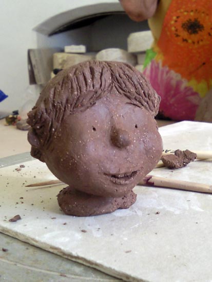
I started attending a clay sculpture class in November 2008, the year before I started working on this picture book. I find clay a great medium to work with, especially for making models of characters. I’d made one sculpture of Knut already- the big-nose version- but I wanted to make an updated version.

Here’s the big-nose one:

big nose sculpture

and here’s the newer one, based on the ’round-cheek’ sketches:

round cheek sculpture

The head isn’t very big, it fits into the palm of your hand.

Then I started making the body over three sessions.

Firstly, I got the basic body parts in there. No detail at this stage.

sculpture-version-1
he looks a bit weird with no clothes on

I hollowed out a hole in the bottom of his head so that it could pivot on his neck. This kept the head stable.

The next time round, I added a base to give him stability, and I put in the details of some clothes.

sculpture-version-2
Much better with clothes I reckon

Then in the third session, I put in finer details- his fingers, the stitching and the wool on his ugg boots, and I shaped his shirt a bit.

sculpture-version-3
version 3- more detailed

I’ve left gaps in his hands to hold a sword and shield, and I’d like to make a model of Wolverine to sit beside him (that’s why the base isn’t symmetrical).

I’m glad I made his head separate, because I’d like to redo it. His face is a bit flat, and his nose and eyes are too high on his head. He also needs his viking helmet! Perhaps I’ll also make some cardboard armour.

So, that’s how the character of Knut developed. From next week, I’ll look at some of the other characters in the book.

Creating the character of Knut- part 4

At this point I had a meeting with Cate to show her my character design for Knut. She gave some great feedback-

  • The gap in the front of his teeth might need to go- kids usually only have those gaps when they’re younger, around 4-6 years old, and Knut was supposed to look a tiny bit older, around 6 to 7 years old.
  • The size of his head, arms and legs in proportion to his body made him look slightly too old- maybe 8 or 9.
  • Maybe reduce the pointiness of his chin, and make his cheeks rounder
  • Wolverine looked great and could stay as he was.

Based on that feedback, I revised the character design on my computer, fiddling with the body proportions.

round-cheek-version-1
revised character design- dated 4/12/09

From there I started resketching the character, making the face rounder and the chin less pointy. This version of Knut I call the ’round-cheek’ version.

round-cheek-version-1
Starting to take shape- dated 17/3/10
round-cheek-version-2
I'm really liking this version now...
Photo0287
...so much so, that I was caught drawing Knut on the whiteboard at work

The body proportions started to look better with this version, and his character was more closely aligned with the text- Knut is a very innocent, sweet and gentle boy. His hairstyle is more consistent now too, with the two little bits of fringe coming down on either side and the little curl at the end. It was a lucky design, because when Knut wears his Viking helmet, his fringe pops out from the front, making him still recognisable.

I had been working on Knut for a long while at this stage- my first sketch had been in June 2009, and the round-cheek sketches were from March 2010 onwards. Here’s how he progressed. Which is your favourite?

many-faces-of-Knut
The many faces of Knut

Next week- I show you how I made a  clay model of the round-cheek version of Knut.