How text and pictures interact (and sometimes don’t)

After finishing all the pencils outlines for the book, Norm and Cate and I stumbled on a problem.

One of the most important scenes in the book wasn’t working. We couldn’t decide if it needed text or not, and when we tried to add text it wouldn’t fit.

Here’s the draft version of the sequence- it’s where Josh meets the bullies for the first time.

pg14 - pg15, draft with colour
pg14 - pg15, draft with colour (click to enlarge)

There’s no text. The pictures can hold their own, mostly- there are some problems though. It’s a little hard to read in between the panels. The fact that each panel is the same viewpoint gives the sequence a plodding feel- there’s no excitement. It would have been great to have the bully skateboarding in from left to right (the same direction as we read words)… but then he would have to reappear from the right and chase Josh towards the left, which would look odd.

Norm thought some text would help, so we tried it as another option. You can see Norm’s love of Westerns in his choice of words (…in an earlier draft we had a town hall clock off in the distance showing the time as High Noon).

pg14 - pg15, draft with extra words (click to enlarge)

I felt that the division of the panels, coupled with short snippets of text, gave the sequence a plodding feel. It’s a little like watching a silent film, where the text and pictures are divided. The actors move, then a slide with the dialogue comes up.

I did the final version of the pencils anyway, hoping that we’d come up with a solution. Norm and Cate worked on some shorter text.

pg14 - pg15, final pencils with shorter words (click to enlarge)

We still weren’t happy with it- it was too hard to tell who was saying what, and was even more plodding.

Time for another try. We cut out the text entirely, and grabbed a bit of Odin’s dialogue from the previous page instead. It seemed to fit the images better. However, it was a bit hard to tell that it was Odin speaking when he wasn’t on the page.

pg14 - pg15, final pencils with Odin text (click to enlarge)

A font change made it a bit clearer (…we’d like to have the Norse Gods speaking in a different font throughout the book if possible).

pg14 - pg15, final pencils with Odin text in different font (click to enlarge)

I still wasn’t happy with the images- they weren’t dramatic enough. This is the crux of the book, this is what makes Josh go off on his adventures. The bullies have to be mean enough to set the story in motion- and the meaner they are now, the sweeter Josh’s victory will be at the end.

So. It was back to the drawing board for me. I met with Norm and Cate and we sketched a new sequence of images. I’ll show you some next week.


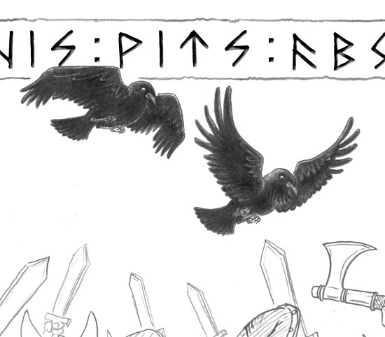
A murder of ravens up for retrial

The ravens in the book are haunting me. I hear them rapping at my chamber door:

Yo there Poe, there’s a raven atcha door

One of those eeky-freaky spooky birds of yore

All the ravin’ ladies getcha tails onto the floor

When ‘m I gonna stop? Gotta tellya Nevermore

No, not ‘rapping’- rapping, as in ‘tapping’. As in the famous poem… anyway. I’ll get on with it shall I.

My point is, the ravens are in the back of my mind a lot these days. I recently finished all the pencil lines for the book. Hurrah! The next step is all the colouring. But before I move on to that, I looked back on the pencils, checking for little issues. And I found inconsistencies in the ravens I’d been drawing. To start with, I’d only looked at a few reference photos, then made it up as I went along. ‘That looks about right,” I’d think to myself. But the ravens didn’t look quite right at all. They looked a little too fluffy and friendly- more like dirty pigeons.

p20-21-20101015

When I drew the last few ravens in the book, I worked from reference photos, and the difference was huge. So I’m going back page by page and redrawing the earlier ravens, using the most excellent reference photos known to man.

Where did I find these most excellent reference photos, I hear you ask? Why, on the website of Paul Lantz, a photographer in Canada. He happens to have a passion for ravens, and has collected dozens of high-resolution photos of them in all sorts of poses and situations. It’s absolutely brilliant. Here’s the gallery.

My favourite series of photos shows a raven being accosted by three crows. There’s one photo where it looks like the raven is exploding.

Using these references, I’ve been able to go back and make the ravens look more realistic. Here’s my more recent sketches – still roughs at this stage.

raven-fixups-2
I’ve been looking at ravens more closely than I ever have before in my life, and it’s made me appreciate them more. Sure they’re a bit creepy. Sure their beady eyes seem to stare into your soul and say, ‘if I could eat your soul, I would.’ But hey, the way that light shines on their black feathers and goes all purply- that’s really beautiful. And the way their feathers stretch out mid flight like razors- just awesome. Ravens rock.

Recent Developments

As I’m currently busy with final artwork, I thought I’d take a different tack for this week’s post- rather than focus on a specific character and their development, I’d show you some more recent sketches and sculptures.

I’ve been looking more closely at ravens lately- though I wish I’d done it sooner. I’ve almost finished all the pencil outlines for the book, and I’ve realised that the ravens in the first three-quarters of the book look like dirty pigeons. The ones I’ve drawn more recently are looking much more accurate, because I’ve been looking at reference photos. Who would have thought that drawing from life was the way to go.

Here’s some studies and some final artwork for the ravens on page 28… (when pages have been tricky, I’ve sometimes been drawing the backgrounds and characters separately, then stitching them together with photoshop).

p28-20101024-ravens-scan

I’ve discovered that ravens have very complicated bodies, and their bodies look different all the time- they can hunch their back, pull their shoulders up, bob their head up and down- and then of course you have all the different movements involved in flying (and then, how to show those movements from different angles). Without reference photos I’d be stuffed.

Here’s another raven drawing- this guy goes on page 25.

raven

I’ve made another Josh sculpture too- I was having trouble getting his profile right, so I put this guy together. He’s more accurate than the previous sculptures I’ve done.

Knut-head-sculpture

At one point I was feeling very stuck- I didn’t know if what I was doing was good enough, and I was fussing over unimportant details. One of my illustrator buddies, Karen Blair, suggested I pull the stick out and draw with some charcoal. Here’s the result- it’s just over A3 size. After doing this sketch, things got a lot easier and much more fun. Cheers Karen.

Josh-charcoal-20100911

Charcoal helps me loosen up my drawing. Here’s a more realistic Westy sketch I did recently in charcoal.

Westy-commission-20100921

And finally, as a super special treat, here’s another sketch- but it’s not by me, it’s by Karen. It’s her take on Josh and Wolverine. Josh’s rosy cheeks looked a little like he’d spent too much time in the sun, hence the caption.

severe-sunburn-boy

Designing the Norse Gods- Forebodin’ Odin, Therious Thor and the others

First off- apologies for missing a week! I’ve been pushing through the final artwork and attending family weddings. Busy busy busy.

The original story mentioned quite a few Norse Gods- Odin, Thor, Sigurd, Freya and Hemrod. Our brilliant editor Cate helped to whittle the text down, removing supplementary characters to focus on Odin and Thor (Check out this post by Norm for more info on Odin and Thor).

Here are my first sketches and notes on the Gods.

http://knutthelastviking.wordpress.com/2010/08/13/odin-the-norse-gods/
Thor on the left, Sigurd on the right
first-research-sketches-2-v2
That's Odin right down the bottom, with some lumpy crows
p13-v1
Odin looked a bit like a pirate here

After a bit of research, I found out that Odin is an old old man. So the black hair wasn’t going to look right for his character. Also, Thor is his son, so they have to look similar.

Storyboard sketches began to take more form…

Continue reading “Designing the Norse Gods- Forebodin’ Odin, Therious Thor and the others”

Designing Odin’s Ravens, Huginn and Muninn

I thought people were hard to draw. Turns out ravens are impossible.

Okay, I’m being melodramatic. They’re not impossible- just difficult. I’ve never made a habit of drawing birds before, so I’ve had to start practicing.

I’m paying attention now. In the last year whenever I’ve seen crows or ravens about, I’ve stopped doing whatever it is I’m doing and I’ve stared. I’ve chased crows around the park with my mobile phone, trying to take videos and pictures. I’ve sat on the grass with my sketchbook and tried to draw them as they hop around, then inevitably fly off, their opinionated squawking trailing into the distance. And my drawings have gotten better (mostly).

Ravens are incredibly intelligent birds, capable of logic and problem solving- I had no idea how intelligent until I started researching on youtube.

There are two ravens in Norse mythology- their names are Huginn and Muninn, which mean Thought and Memory. They belong to Odin; every day they fly around the world (the land of humans known as ‘Midgard’) and note the events taking place. Then they fly back to Odin to report.

So in our story, the ravens provide a vital link between Josh’s world and the world of the Viking Gods. When the ravens turn up, the Gods aren’t far away.

My first sketches in the storyboards were merely placeholders- rough ideas of where the ravens would go, once I knew how to draw them.

ravens-1

Many sketches later…

ravens-recent-sketches-1

…and I’ve learnt to draw some better looking birds.

ravens-2

Random facts about ravens:

  • You’ve probably heard that a group of crows is called a ‘murder’. The same name is used for a group of ravens, but there are some other suggestions floating about too : a conspiracy, an unkindness, a storytelling, a congress and a parliament are also used. (Or at least, that’s what a quick google search told me).
  • Ravens were used as symbols in Viking times, and can be found on flags, in the Bayeux Tapestry, and on helmets.
  • There is an Australian species of raven, found in WA (around Perth and on Rottnest Island), and in much of the eastern states.
  • There isn’t much difference between a crow and a raven. They belong to the same family of birds. Ravens are usually bigger.

How to Draw Bullies

There’s a bunch of bullies in the book that badmouth and boss and generally behave like bumheads.

In the original storyboard Norm and I had the idea to make them faceless and shadowy, shown only in silhouette until the final pages. If you can’t see their faces they become creepier… the reader can add whatever face they want to the bullies. We thought this would be clever.

When we saw it as a picture, it wasn’t clever.

Here’s one version of the faceless bullies (with an early version of Norm’s text):

bullies-original

One problem with making them faceless is that you can’t quite tell how old they are. They’re supposed to be around Josh’s age, maybe slightly older and bigger- but here they look like teenagers.

It’s a good viewpoint, but it’s too terrifying, particularly when their age is unspecified. And the obvious threat of physical abuse is not appropriate for a children’s book.

The original was worse-

earlier-bully-scene

Here you can’t tell how old they are at all. They could be 30. Horrible. It needed to change.

Now, the bullies are shown for what they are- nasty little boys. The sequence below is from the colour roughs.

p15-no-words

Wolverine was fun to draw in this sequence. He could finally show some expressions other than very happy and happy.

(Norm and Cate are still negotiating over the text for this sequence, so I’ve left it out. You’ll get to read it in the final book.)

Designing Josh’s other rellies- Nan, Mum and Dad

I’ve mentioned before on this blog that all the characters are based in some way on people I know. That’s mostly true.

Josh’s Nan is based on a friend at my day job, Lea. They’re not similar in personality (Lea isn’t grumpy like Nan)- it’s more in the facial features… their hairline and glasses are very similar.

I wanted Nan to be non-stereotypical, so my original plan was for her to be a funky grandma (which Lea liked the sound of). But then when Pop became this cuddly bear-like Viking man, Nan needed to be more boring in comparison- good cop/bad cop.

Here’s one of the first sketches of Nan, from the first storyboard. This image changed, but I love the look of horror on Nan’s face. She’s upset because Josh has announced he’ll be worshipping the Norse Gods.

Nan-1

The original script had Josh being sent to Sunday School, but it was taken out… our editor Cate suggested that Sunday School wasn’t relevant to kids today, and we wouldn’t want to set up a theme of Christianity vs Paganism. Excellent point.

Nan-2

So, Nan’s a tough woman. Here’s a more recent sketch.

Nan-recent-sketch

Josh’s dad and mum make few appearances in the book- only at the start and the finish. Dad is based on me. Not that I’m a Dad. But I wanted the dad to be easy to draw, so I picked a face I’m familiar with- my own.

The mum’s hair is based on a lady I met through my day job- she’d come along to a training session I was running, and she had this awesome bit of fringe hanging over her forehead and a big ponytail. I sketched her in a quiet moment, intending to use her hair for a character in a different story- but then Josh’s mum seemed to like it so she took it for herself.

Here’s the first scribbly sketch of Josh’s family around the breakfast table.

mum-and-dad-1And here’s the final rough…

mum-and-dad-2

Here’s the whole clan.

mum-and-dad-3

Designing Josh’ Grandad. First name, Pop- last name, Gohsaweezel

That’s not true. I don’t know what Pop’s surname is. What I do know, is that he’s a major character in the book, and a major influence on Josh. He introduces the little bloke to Vikings, and encourages his efforts to be more brave and Viking-like.

Norm and I definitely didn’t want him to look staid and boring, like a nerdy historian or your standard beige oldie. He had to have presence and something different about him.

I’ve based most of the characters in the book on people I know. Pop is based on Norm, even though Norm has neither a moustache nor a beard. Without realising it, I guess he’s also based on my dad, who has a moustache. But no beard.

Here’s the first character sketch of Pop, with some notes. You can see he has similar hair to Josh, but his fringe curls up to make ‘horns’ like a Viking helmet.

Pop-first-sketch

At one point, Pop was going to have a motorbike in his shed. He even had a Celtic tattoo on his arm in the first storyboard.

Pop-tattoo

He’s changed a little though, become softer in character- but his appearance has stayed mostly the same. Here’s some comparisons of Pop from the first storyboard (top row) to the latest storyboard (bottom row).

Pop-comparisons

Not much change really. He was good to go from that first sketch. But I’ve needed to go back to my first sketches and check the character tags (defining features), making sure I’m drawing him consistently. He’s still a bit different in each of those sketches above.

Here’s some more recent sketches of him. I’ve been practicing drawing all the characters in a little jotter pad, trying to get them consistent and rough, to be able to draw them fairly accurately without trying too hard. It’s making the final artwork look more spontaneous and fluid, and it’s helping me to not care so much about whether the artwork is ‘perfect’ or not.  I’m finding that the less perfect it looks, the more perfect it feels- corny but true.

Pop-recent-sketches

Here’s a panel from the colour storyboard (…I’ve used Photoshop and a Wacom Intuos3 (graphics tablet) to try out colour with the final storyboard.)

It’s a big symbolic moment, where Pop gives Josh his Viking sword, while heavenly light shines down from the window. You can almost hear the Valkyries singing angelically in the background.
The-gift

And here’s a sneak peek at a final artwork sample, just completed! It’s another significant moment, where Pop gives Josh a book on Vikings. This is a scan of a pencil sketch, with digital watercolour applied in Corel Painter.

p8-v7-20100904-colours-sneakpeek