Meet the Cast of ‘My Dead Bunny’ (part 2)

20140501-cast-sheet-boys-only

My new book is about a zombie rabbit. It’s written by Sigi Cohen and it’s called My Dead Bunny.

Earlier this week I showed some reference sketches for the secondary characters: Mum, Dad and the sister.

Today I’m focusing on the three main (human) characters: the unnamed narrator (who I named Sigi after the author), and his friends Billy and Stan.

Continue reading “Meet the Cast of ‘My Dead Bunny’ (part 2)”

Meet the Cast of ‘My Dead Bunny’ (part 1)

My new book is about a zombie rabbit. It’s written by Sigi Cohen and it’s called My Dead Bunny.

This week and next, I’m writing three posts to introduce you to the cast of the book.

Continue reading “Meet the Cast of ‘My Dead Bunny’ (part 1)”

Evolution of a scene: the final version of ‘Big Trouble’

pg22-23-5-finalLast week I posted the roughs for this scene from The Last Viking Returns. This post will show how I got from my almost-final rough to my final illustration.

Continue reading “Evolution of a scene: the final version of ‘Big Trouble’”

Evolution of a scene: the rough sketches for ‘Big Trouble’

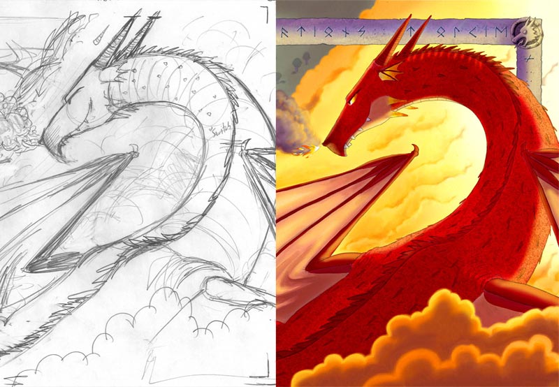
pg23-rough-vs-final
final rough on the left, finished version on the right

There’s a scene in The Last Viking Returns called ‘Big Trouble’ where Fafnir the dragon is finally revealed in all his terrible glory. The scene went through a lot of changes during development, so I thought I’d share them here.

It’s a lot of pics though so I’ll share them in two parts. This post will show you the roughs, and next week’s post will show how the final illustration was put together.

(And if you haven’t read the book yet, there’s a few SPOILERS below.)

Continue reading “Evolution of a scene: the rough sketches for ‘Big Trouble’”

Designing Viking World – the entrance gate

TLV2---2-weeks-to-go

There’s only a fortnight until the release of The Last Viking Returns  on Sept 1st! This is my last behind-the-scenes post before then.

I’ve been focusing on one of the main settings in the book – a theme park called Viking World. There’s a moment early in the book where the family arrives at the park for the first time, and I wanted Josh to have a sense of awe. The text only says “Wow”, so I was free to fill in the rest.

My first sketch looked like this. Not terribly impressive, not awe-inspiring at all, but it helped me to figure out what goes where.


pg6-scans

Continue reading “Designing Viking World – the entrance gate”

Designing Viking World – the visitor map

TLV2---3-weeks-to-go

There’s only 3 (!) weeks until the release of The Last Viking Returns on September 1, and I’ve got a couple more behind-the-scenes things to show.

I’ve been focusing on one of the main settings in the book – a theme park called Viking World. I had to figure out the rough layout of the park early on so that I could map the journey made by Pop, Josh and the family. I also wanted to make the backgrounds of each illustration consistent with the map so that the reader could really believe in the fictional setting.

Continue reading “Designing Viking World – the visitor map”

Designing Viking World – the shops and restaurants

pg5---5-weeks-to-goThere’s only 5 weeks until the release of The Last Viking Returns (Sept 1st), and each week until then I’ll show some more behind-the-scenes images.

I’m focusing on one of the main settings in the book – a theme park called Viking World. The theme park has many places where patrons can buy food and souvenirs, just like a real theme park.


Most of Viking World is in fact based on a real theme park – Universal Studios in Singapore. Norman and I attended conferences in Singapore in 2012 and 2013, and on both occasions we set aside a day to visit Universal (you can read more about our adventures here).

I remember vividly the entrance to Universal Studios and the sense of awe I felt. I knew it was all fake and ridiculous and designed to unburden me of my wallet, but I got caught up in the spectacle and the excitement of it all. Here’s the main street as you enter the park (that’s Norm in the middle):

Universal Studios Singapore entrance

All the shops and eateries tie back into the theme of the park, which is movies.You can buy t-shirts and soft toys and all that usual stuff, but you can also buy fresh popcorn, and Oscar statuettes, and movie costumes.

So for our park – Viking World – all the shops, restaurants and stalls would need to relate back to Vikings. Surely it wouldn’t be hard to come up with some ideas?

Continue reading “Designing Viking World – the shops and restaurants”

Designing Viking World – the Statue of Thor

There’s only 6 weeks until the release of The Last Viking Returns (Sept 1st), and each week until then I’ll show some more behind-the-scenes images.

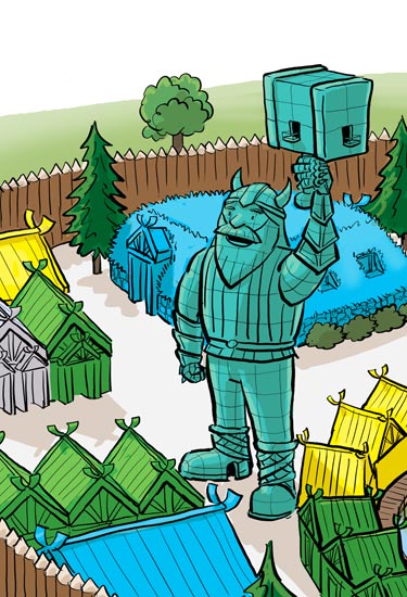
I’m going to focus on one of the main settings in the book – a theme park called Viking World. The theme park has a massive statue of Thor.

Patrons are able to climb the stairs inside the statue; there are viewing platforms inside his mouth and the hammer. Naturally, the statue is closed during thunderstorms.

statue of Thor
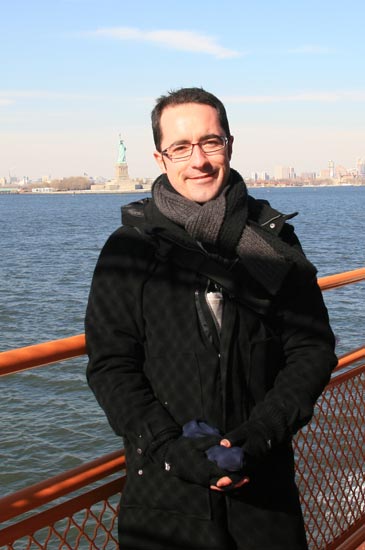
The most obvious influence for the statue is New York’s Statue of Liberty, which I ferried past a few years ago. Turned out it wasn’t very big – smaller than my head, in fact.

statue of liberty 2

Ba-doom tish.

Continue reading “Designing Viking World – the Statue of Thor”

Character design – choosing colours for the cast

Over the last 3 months I’ve posted my rough sketches for all the characters in the book.

I’ve covered Josh’s family, all the Viking characters and the two villains.

This post gathers all the colour reference versions together so you can see the links between them.

I’ve made some notes on each major group of characters and their colours. Most of the time my colour choices were a matter of gut feeling, and it’s only after the fact that I can figure out why certain combinations seemed to work.


First up is Josh’s family.

I didn’t intentionally make Josh’s costume out of primary colours, but it turned out that way – yellowish hair, red helmet and shield, blue shirt. Add a bit of green and you’ve got a bunch of bright happy colours, which all help Josh stand out from whatever moody background he’s in front of.

Wolverine’s colander helmet and collar are the same shade of gold and red found on Josh’s chestplate. This sharing of colour is a simple way to link Josh and Wolverine together.

Josh’s siblings are in blue and red shirts – the same blue and red found in Josh’s costume. Their shorts/skirt are darker shades of the blue and red respectively. All three children have the same colour boots. Again, it’s about linking Josh with his siblings in the eye of the reader using colour.

Nan is the only one in the family to wear a shade of purple. I find it a loud colour for some reason; I don’t wear it a lot, and it seems to clash with a lot of colours I normally use. This fits with Nan’s no-nonsense, outspoken personality. I made it a soft, warm shade of purple though (at least to my slightly colour-blind eyes) as it seemed like a colour a loving, caring (but feisty) Nan might wear. The sneakers have purple trim in the same shade.

Pop is all in shades of grey – warm shades, tinges of brown in there. The dark vest is a strong contrast to the colour of his skin, shirt and pants. His colours seem warm and masculine and strong to me. Bright colours just didn’t seem to suit Pop; he’s silly and child-like, but he’s strong and grounded. I imagine he would give very big bear hugs. His colours make him stand out, not only from his wife but from all the other characters in the family.

character-sheet--family-550px

Continue reading “Character design – choosing colours for the cast”